
What’s in a colour? Plenty of calmness, thrill, excitement, and soberness. This is not straight out of a fantasy movie but a reflection of the runway collections for the spring/summer 2017 season at New York Fashion Week.
This is where Pantone, the color expert company came out and released its color analysis. So here are the top 10 colors of next Spring, courtesy Pantone, as also what color to wear for Fall.
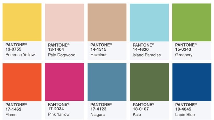
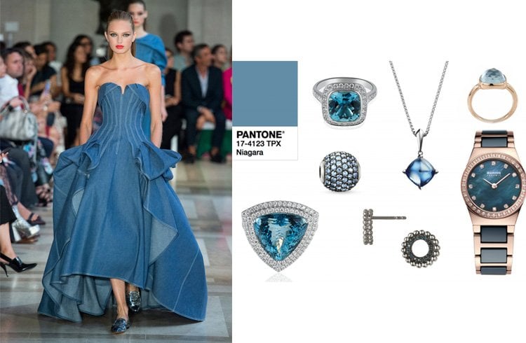
Niagara 17-4123
Well, you might get a whiff of Niagara Falls, this time (you know that sublime scenery and relaxing water sound).
[ Also Read: How To Wear The Pantone Color Of The Year, Greenery ]
The next interesting thing is that the first place of the spring 2017 color trends belongs to Niagara. This soft blue hue looks denim like so much so that Pantone experts dub it as medium-grade denim.
Though it is described as a denim shade, the real splendor crops up when it is done on exquisite fabric such as silk. As for now, discover Niagara in the form of denim buttons to the classic denim miniskirt.
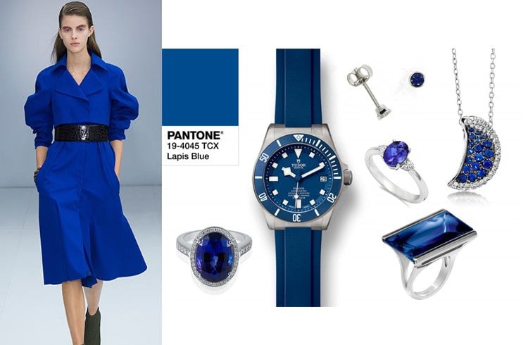
Lapis Blue 19-4045
This Pantone color is notched beyond the standard navy, although navy is supposedly a signature color of the fall.
While Lapis Blue is apt for autumn dresses, this intense blue shade is strong and confident and has loads of inner radiance.
[sc:mediad]
Incidentally, Lapis Blue is a natural shade of the stone lapis lazuli and has jazzed up the Salvatore Ferragamo runway many times.
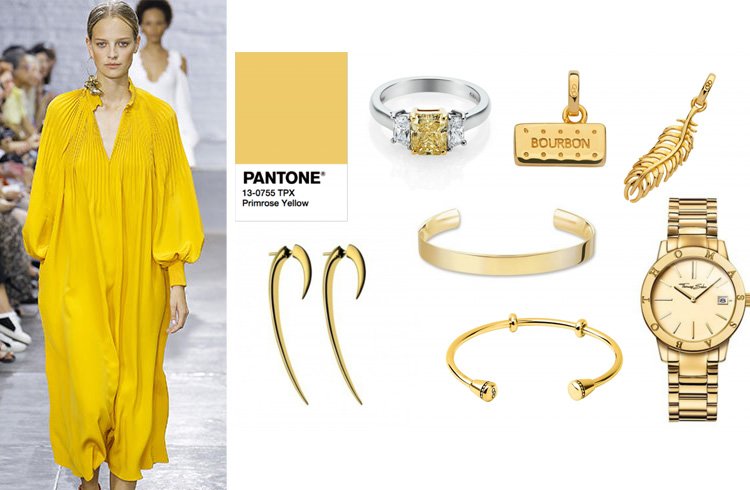
Primrose Yellow 13-0755
A sunny and buttery yellow, Primrose showed its flair in the runway collections for spring/summer 2017. This joyful looking Pantone color can be worn in a high-waist flare pant when it comes to cooler temperatures. Blame it on the lovely flower primrose.
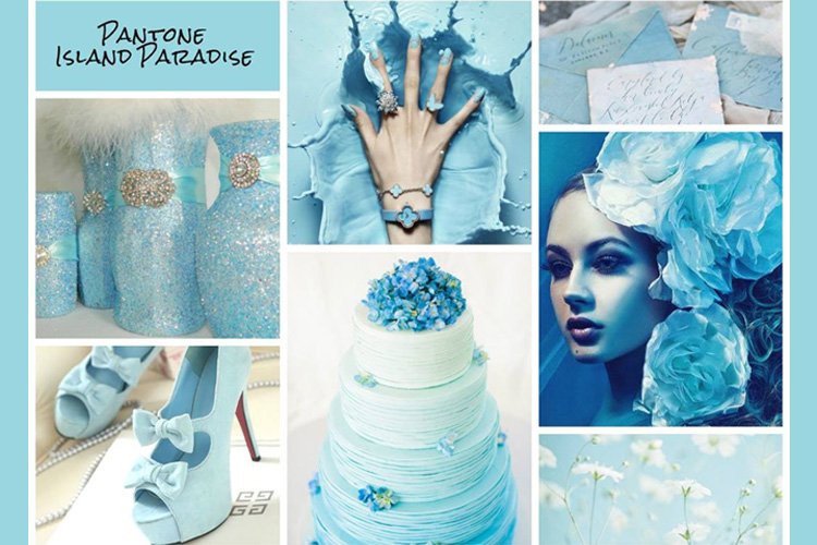
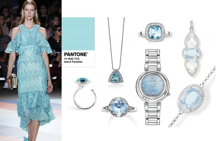
Island Paradise 14-4620
A refreshing aqua that brings to mind a change of scenery. Pantone Island Paradise is a cool blue-green shade which symbolizes tropical settings and a desire to rewind. Wear this Pantone color as a dress cut for fall preferably below-the-knee outfits with a short or long sleeve.
[Also Read: Pantone Color]
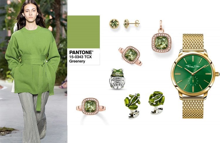
Since it is the color of foliage, this Pantone shade spreads healthy lifestyle all around.
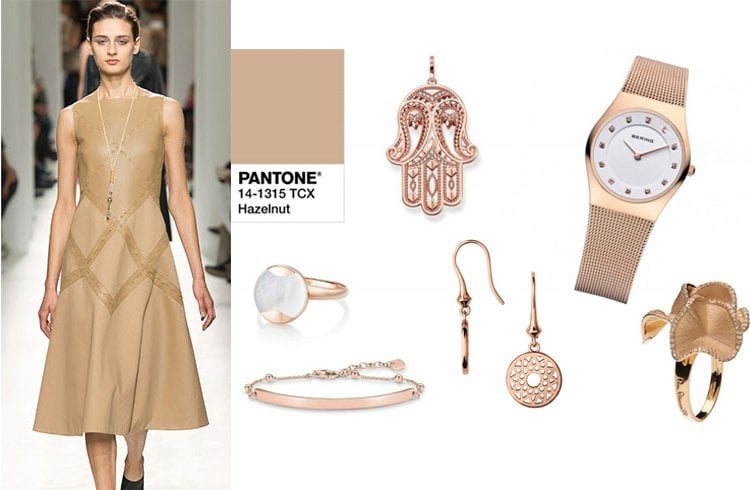
Hazelnut 14-1315
As a key neutral for spring, the Pantone shade brings a natural earthiness to mind. Inherent warmth and unpretentious, this color connects the seasons effortlessly.
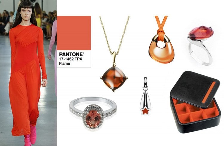
Flame 17-1462
As a red-based orange, Flame Pantone color is gregarious and fun-loving. It is vivacious and flamboyant too, which suitably brings fiery heat to the spring 2017 palette.
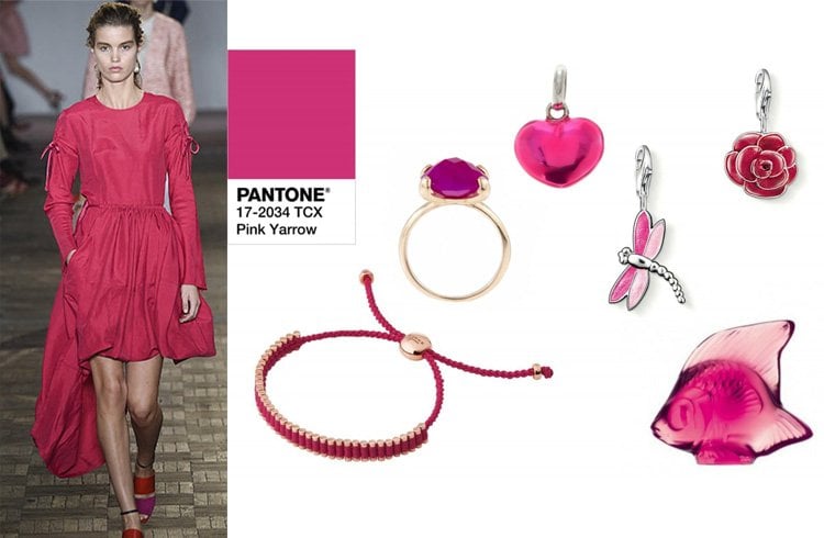
Pink Yarrow 17-2034
Call it a pink revolution in the fashion circuit, Pink Yarrow as Pantone colour ranges from amaranth and brick pink to raspberry and ultra-pink.
Close to magenta, the Pink Yarrow is an attention-grabbing and luxuriant shade when it comes to summer 2017 color trends.
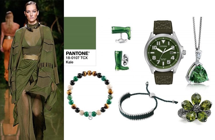
Kale 18-0107
This is another green shade of spring/ summer 2017 color trend that depicts a healthy lifestyle. Being an army shade it is ideal for any outerwear.
Such is its fame that saw jackets and trench coats in Kale for the spring/ summer 2017 runways are bursting at seams.
What is the final analysis as per Pantone’s Spring 2017 Fashion Color Report? The spring of 2017 is likely to see all the colors of nature on garments.
There is no point agreeing or disagreeing as Pantone is the color authority. You tell us which of the shades shown you liked most and which you plan to adopt in your day life.
Images Source: pinterest.com